Masonry Layout Using CSS Grid

You've probably seen the masonry layout in use all over the web (including in the image above). Traditionally this has been created using javascript, but nowadays it's possible to create the same effect in CSS, though it takes a bit of effort.
The example
You can see this technique in action on our CSS Grid masonry example page where the brave amongst you can just view source to see what's going on and dive right in.
How it works
There are various ways to create a masonry layout in modern CSS (there's a great round-up here on CSS Tricks) – this technique uses CSS Grid. If you've not met CSS Grid before then you can get to know it in the Grid Garden.
Here are the basics of how it works:
- Define a layout for each of the break point sizes you want to use. In the example there is a single column layout for the smallest screen sizes (less than 520px), 4 columns for mid-size screens and 5 columns for anything wider than 960px.
- Create a responsive grid with named areas for each of the multi-column layouts. The trick to making the grid responsive while maintaining the correct aspect ratio for our masonry blocks is to use
vwviewport width units for both the column widths and row heights (there's a good introduction to viewport units here). - Assign each masonry block to its appropriate area for each of the defined layouts.
Pros and cons of this approach
This technique isn't for everyone, but there are a few big advantages of using CSS Grid over the original javascript approach:
- Exact layout: you have full control over the relative size and shape of every element in the grid rather than relying on an algorithm.
- No need to use any javascript libraries so your page loads faster.
- Fully responsive using CSS, so no javascript listeners to slow down your page.
However, the main advantage (exact layout) is also the main drawback of this approach: you need to set the layout yourself in advance, which takes a bit of time and effort.
How we made the example, step by step
Design the grids
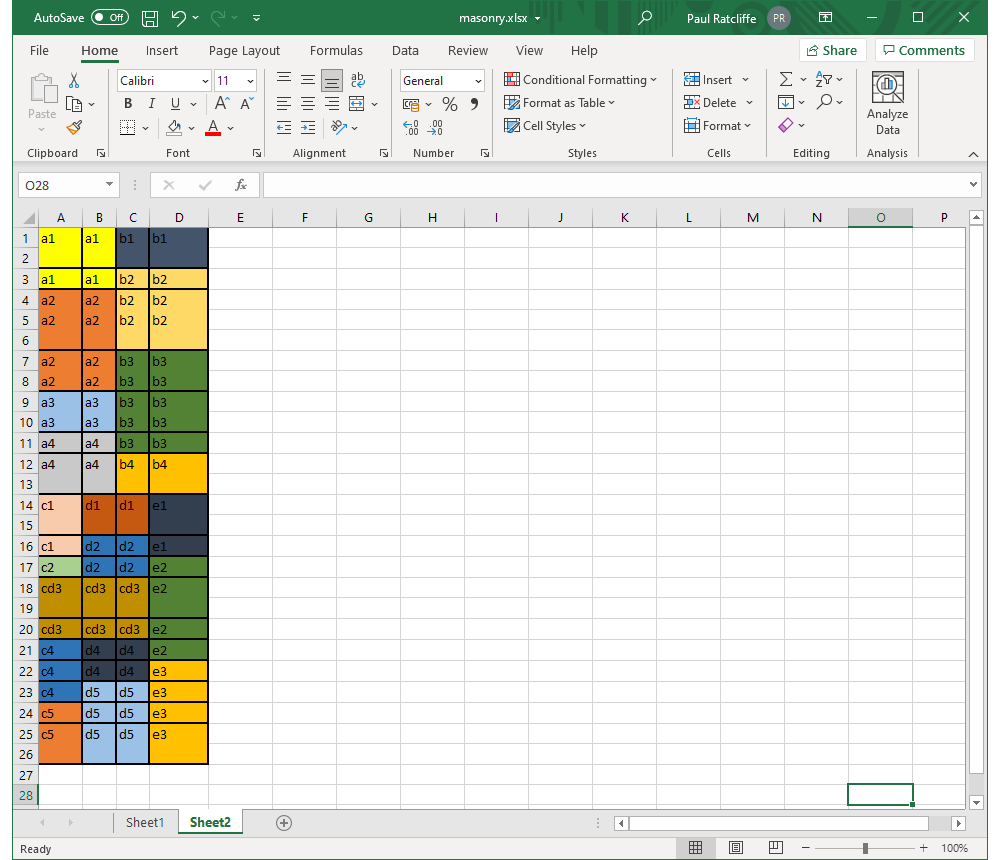
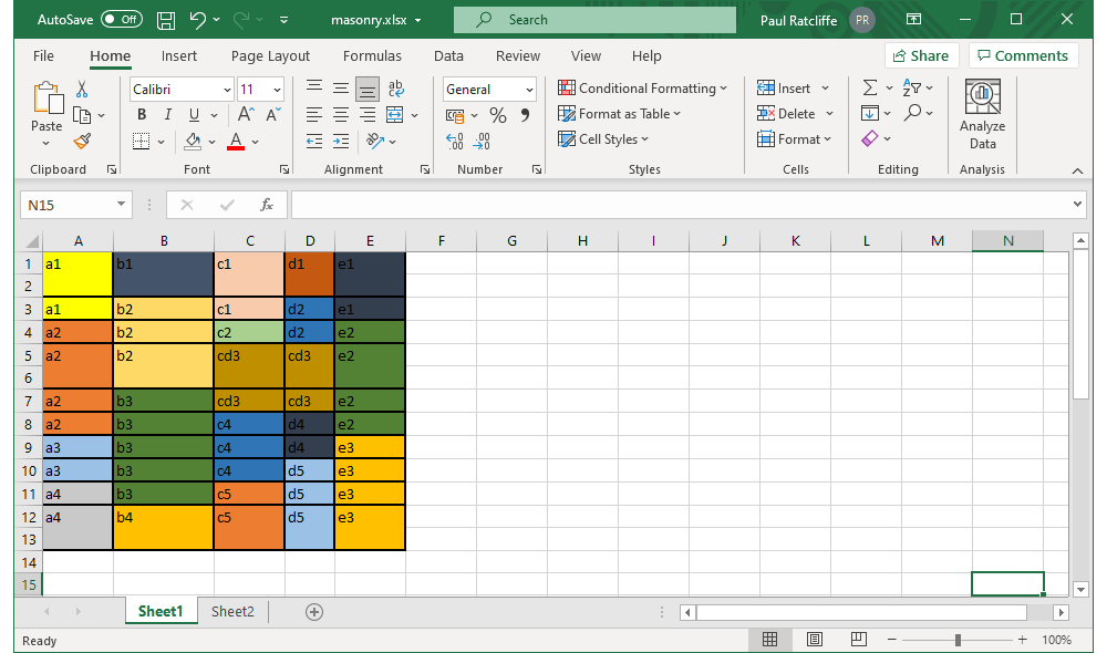
First up, design your grids. I used Excel to visualize the grids for the mid- and full-size views (our single column layout doesn't need a grid) but a toddler with a bunch of photos, some glue and a big piece paper would also be a valid approach.
The midsize 4 column grid design in Excel, with each area given a unique label.
The fullsize 5 column grid design in Excel, with each area given a unique label.
Do some maths
Next up some maths. For a nominal full HD display (1920px by 1080px) I wanted my full-size grid to take up 1 full screen width (1920px) and 2 full screen heights (2160px), a ratio of 1:1.125. As we're using vw viewport units throughout that means that the grid is 100vw wide and 112.5vw high.
- Based on the relative sizes of the columns in our mockup for the full-size grid, that gives column widths of 19.5
vw27.75vw19.5vw13.75vw19.5vw - Rows are a bit trickier as they don't line up neatly, but by paying attention to the bold lines in our mockup we can work out relative row heights of 17.3
vw8.65vw8.65vw17.3vw8.65vw8.65vw8.65vw8.65vw8.65vw17.3vw
These values drop directly into the CSS like this:
.s-grid {
    display: grid;
    grid-template-columns: 19.5vw 27.75vw 19.5vw 13.75vw 19.5vw;
    grid-template-rows: 17.3vw 8.65vw 8.65vw 17.3vw 8.65vw 8.65vw 8.65vw 8.65vw 8.65vw 17.3vw;
}
For the mid-size grid we imagine a display that's 960px wide and 540px high and we want the grid to take up 4 full screen heights (2160px). So the ratio for the mid-size grid is 1:2.25 which is 100vw wide and 225vw tall. Crunching the numbers gives:
.s-grid {
    display: grid;
    grid-template-columns: 37vw 4.3vw 21.7vw 37vw;
    grid-template-rows: 34.62vw 17.31vw 51.93vw 34.62vw 34.62vw 17.31vw 34.62vw 34.62vw 17.31vw 17.31vw 51.93vw 17.31vw 17.31vw 17.31vw 51.93vw;
}
Define your areas
Next, we define grid-template-areas. These sound a bit daunting when you read up on them but really it's just a matter of creating a quick text 'sketch' of our grid. In fact, we can just copy and paste the labels we added to our Excel diagram, add a few double-quotes and we're done. Here's the CSS for the full-size grid including the areas, compare it to the image of the full-size grid in Excel and you will quickly see what's going on:
.s-grid {
    display: grid;
    grid-template-columns: 19.5vw 27.75vw 19.5vw 13.75vw 19.5vw;
    grid-template-rows: 17.3vw 8.65vw 8.65vw 17.3vw 8.65vw 8.65vw 8.65vw 8.65vw 8.65vw 17.3vw;
    grid-template-areas:
      "a1 b1 c1 d1 e1"
      "a1 b2 c1 d2 e1"
      "a2 b2 c2 d2 e2"
      "a2 b2 cd3 cd3 e2"
      "a2 b3 cd3 cd3 e2"
      "a2 b3 c4 d4 e2"
      "a3 b3 c4 d4 e3"
      "a3 b3 c4 d5 e3"
      "a4 b3 c5 d5 e3"
      "a4 b4 c5 d5 e3"
  ;
}
And here's the equivalent for the mid-size grid:
.s-grid {
    display: grid;
    grid-template-columns: 37vw 4.3vw 21.7vw 37vw;
    grid-template-rows: 34.62vw 17.31vw 51.93vw 34.62vw 34.62vw 17.31vw 34.62vw 34.62vw 17.31vw 17.31vw 51.93vw 17.31vw 17.31vw 17.31vw 51.93vw;
    grid-template-areas:
      "a1 a1 b1 b1"
      "a1 a1 b2 b2"
      "a2 a2 b2 b2"
      "a2 a2 b3 b3"
      "a3 a3 b3 b3"
      "a4 a4 b3 b3"
      "a4 a4 b4 b4"
      "c1 d1 d1 e1"
      "c1 d2 d2 e1"
      "c2 d2 d2 e2"
      "cd3 cd3 cd3 e2"
      "c4 d4 d4 e2"
      "c4 d4 d4 e3"
      "c4 d5 d5 e3"
      "c5 d5 d5 e3"
  ;
}
Make some blocks
That's all the hard work of building the grids, now we need something to put into them. We've used div elements containing images from a placeholder website such as Lorem Picsum but it could be any element (or mixture of elements) you like, just make sure you set it to display: block. Each block also needs a unique class so we can associate it with the correct area in the grid -- we've used block- followed by the code for the area, e.g. block-a1. For example:
<div class="s-grid">

  <div class="s-grid-block block-a1">
    <img class="block-img" loading="lazy" src="https://picsum.photos/748/996" alt="" width="748" height="996" />
  </div>

  <div class="s-grid-block block-a2">
    <img class="block-img" loading="lazy" src="https://picsum.photos/748/1660" alt="" width="748" height="1660" />
  </div>

...

</div>
Assign blocks to areas
Next, we assign our blocks to the appropriate grid-template-areas like this:
.block-a1 {
  grid-area: a1;
}
.block-a2 {
  grid-area: a2;
}
...
Tidy up and make it reponsive
Finally, we just need to tie it all together by adding a few extra CSS declarations to make everything play nicely and combining everything with some appropriate @media queries. Here's our final stylesheet:
.s-grid {
  width: 100%;
  overflow: hidden; /* Stop a scrollbar appearing if rounding of sizes pushes us over 100vw */
  margin: 0;
  padding: 0;
}
.block-img {
  display: block; /* Stop extra space being added for text descenders */
  /* For the single column display make everything 100% width and preserve aspect ratio */
  width: 100%;
  height: auto;
}

@media (min-width: 520px){

  .block-img { /* For the multi-column display make the images fill the defined grid area */
    height: 100%;
    object-fit: cover;
  }
  .s-grid {
    display: grid;
    grid-template-columns: 37vw 4.3vw 21.7vw 37vw;
    grid-template-rows: 34.62vw 17.31vw 51.93vw 34.62vw 34.62vw 17.31vw 34.62vw 34.62vw 17.31vw 17.31vw 51.93vw 17.31vw 17.31vw 17.31vw 51.93vw;
    grid-template-areas:
      "a1 a1 b1 b1"
      "a1 a1 b2 b2"
      "a2 a2 b2 b2"
      "a2 a2 b3 b3"
      "a3 a3 b3 b3"
      "a4 a4 b3 b3"
      "a4 a4 b4 b4"
      "c1 d1 d1 e1"
      "c1 d2 d2 e1"
      "c2 d2 d2 e2"
      "cd3 cd3 cd3 e2"
      "c4 d4 d4 e2"
      "c4 d4 d4 e3"
      "c4 d5 d5 e3"
      "c5 d5 d5 e3"
    ;
  }
  .block-a1 {
    grid-area: a1;
  }
  .block-a2 {
    grid-area: a2;
  }
  .block-a3 {
    grid-area: a3;
  }
  .block-a4 {
    grid-area: a4;
  }
  .block-b1 {
    grid-area: b1;
  }
  .block-b2 {
    grid-area: b2;
  }
  .block-b3 {
    grid-area: b3;
  }
  .block-b4 {
    grid-area: b4;
  }
  .block-c1 {
    grid-area: c1;
  }
  .block-c2 {
    grid-area: c2;
  }
  .block-cd3 {
    grid-area: cd3;
  }
  .block-c4 {
    grid-area: c4;
  }
  .block-c5 {
    grid-area: c5;
  }
  .block-d1 {
    grid-area: d1;
  }
  .block-d2 {
    grid-area: d2;
  }
  .block-d4 {
    grid-area: d4;
  }
  .block-d5 {
    grid-area: d5;
  }
  .block-e1 {
    grid-area: e1;
  }
  .block-e2 {
    grid-area: e2;
  }
  .block-e3 {
    grid-area: e3;
  }

}

@media (min-width: 960px){
  .s-grid {
    grid-template-columns: 19.5vw 27.75vw 19.5vw 13.75vw 19.5vw;
    grid-template-rows: 17.3vw 8.65vw 8.65vw 17.3vw 8.65vw 8.65vw 8.65vw 8.65vw 8.65vw 17.3vw;
    grid-template-areas:
      "a1 b1 c1 d1 e1"
      "a1 b2 c1 d2 e1"
      "a2 b2 c2 d2 e2"
      "a2 b2 cd3 cd3 e2"
      "a2 b3 cd3 cd3 e2"
      "a2 b3 c4 d4 e2"
      "a3 b3 c4 d4 e3"
      "a3 b3 c4 d5 e3"
      "a4 b3 c5 d5 e3"
      "a4 b4 c5 d5 e3"
    ;
  }
}
And here's the full HTML for the grid:
<div class="s-grid">

  <div class="s-grid-block block-a1">
    <img class="block-img" loading="lazy" src="https://picsum.photos/748/996" alt="" width="748" height="996" />
  </div>

  <div class="s-grid-block block-a2">
    <img class="block-img" loading="lazy" src="https://picsum.photos/748/1660" alt="" width="748" height="1660" />
  </div>

  <div class="s-grid-block block-a3">
    <img class="block-img" loading="lazy" src="https://picsum.photos/748/664" alt="" width="748" height="664" />
  </div>

  <div class="s-grid-block block-a4">
    <img class="block-img" loading="lazy" src="https://picsum.photos/748/996" alt="" width="748" height="996" />
  </div>

  <div class="s-grid-block block-b1">
    <img class="block-img" loading="lazy" src="https://picsum.photos/1066/664" alt="" width="1066" height="664" />
  </div>

  <div class="s-grid-block block-b2">
    <img class="block-img" loading="lazy" src="https://picsum.photos/1066/1328" alt="" width="1066" height="1328" />
  </div>

  <div class="s-grid-block block-b3">
    <img class="block-img" loading="lazy" src="https://picsum.photos/1066/1660" alt="" width="1066" height="1660" />
  </div>

  <div class="s-grid-block block-b4">
    <img class="block-img" loading="lazy" src="https://picsum.photos/1066/664" alt="" width="1066" height="664" />
  </div>

  <div class="s-grid-block block-c1">
    <img class="block-img" loading="lazy" src="https://picsum.photos/748/996" alt="" width="748" height="996" />
  </div>

  <div class="s-grid-block block-c2">
    <img class="block-img" loading="lazy" src="https://picsum.photos/748/332" alt="" width="748" height="332" />
  </div>

  <div class="s-grid-block block-cd3">
    <img class="block-img" loading="lazy" src="https://picsum.photos/1278/996" alt="" width="1278" height="996" />
  </div>

  <div class="s-grid-block block-c4">
    <img class="block-img" loading="lazy" src="https://picsum.photos/748/996" alt="" width="748" height="996" />
  </div>

  <div class="s-grid-block block-c5">
    <img class="block-img" loading="lazy" src="https://picsum.photos/748/996" alt="" width="748" height="996" />
  </div>

  <div class="s-grid-block block-d1">
    <img class="block-img" loading="lazy" src="https://picsum.photos/530/664" alt="" width="530" height="664" />
  </div>

  <div class="s-grid-block block-d2">
    <img class="block-img" loading="lazy" src="https://picsum.photos/530/664" alt="" width="530" height="664" />
  </div>

  <div class="s-grid-block block-d4">
    <img class="block-img" loading="lazy" src="https://picsum.photos/530/664" alt="" width="530" height="664" />
  </div>

  <div class="s-grid-block block-d5">
    <img class="block-img" loading="lazy" src="https://picsum.photos/530/1328" alt="" width="530" height="1328" />
  </div>

  <div class="s-grid-block block-e1">
    <img class="block-img" loading="lazy" src="https://picsum.photos/748/996" alt="" width="748" height="996" />
  </div>

  <div class="s-grid-block block-e2">
    <img class="block-img" loading="lazy" src="https://picsum.photos/748/1660" alt="" width="748" height="1660" />
  </div>

  <div class="s-grid-block block-e3">
    <img class="block-img" loading="lazy" src="https://picsum.photos/748/1660" alt="" width="748" height="1660" />
  </div>

</div>
See it in action on the example page.
Taking it further
The example we've been using in this article only contains images, and always expands to fill the viewport no matter how large that is. In the real world you might need something a bit more refined, and this technique can handle that no problem.
You can see a real world example on the services page of the I DO YOUR TAX website. There are a few expansions to the example on this implementation (feel free to view the source yourself to see how they work):
- We've added gutters between the blocks.
- Each block contains an image, a caption and a link rather than just an image.
- We've used the
<picture>tag to provide art direction on the images, changing from portrait in the two column grid to square in the single column version. - There's a maximum width to the grid instead of growing infinitely.
- We've added some CSS transitions on page load (tiny bit of javascript required, we used the technique described here).
Questions or comments?
Hit us up on Twitter @RefinedPractice, drop Paul Ratcliffe a line on LinkedIn or get in touch using the details below ↓.
